The following is excerpted from Retrofit magazine.
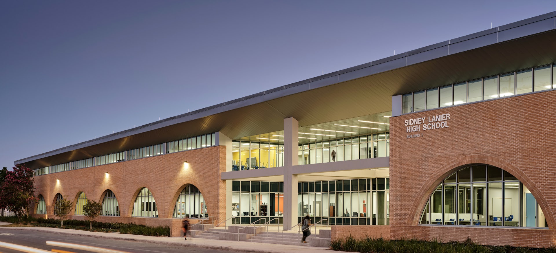
The challenge and opportunity in the design process [for Sidney Lanier High School] lay within the school’s fortress-like appearance and boxy design. Heavy walls, exterior brick arches and windowless classrooms meant the school felt dark and closed off from the outside. The interior layout wasn’t easy to follow, leaving many disoriented. Students were cramped in small classrooms with few meeting spaces outside of classrooms. But the building was structurally sound and flexible enough for a strategic redesign.
To make it work, the team sliced off the roof and top section of the walls to add clerestory windows while inserting a central entry nave to create the atrium and the open entryway—adding light and energizing the interior.


