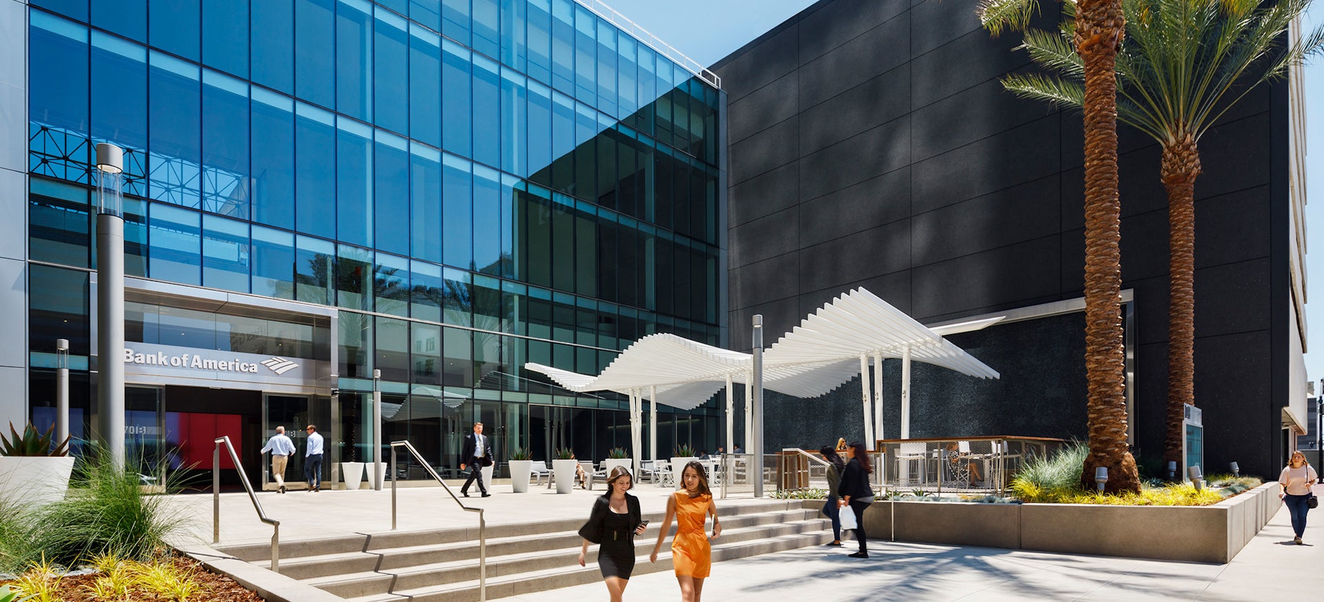
Looking to provide an “urban oasis” in downtown San Diego, a 571,000 square-foot office building offers luxury amenities paired with modern architecture. With a remodeled lobby and entryway from LPA Design Studios, the building provides a place tenants can enjoy while also making the property more marketable for its former owner, Emmes Asset Management Group.
Located at 701 B Street and spanning a full city block, the project began in 2016 and was completed in 2018. Following renovations, the property was sold to Regent Properties by Emmes earlier this year.
“When 701B came about, that building was not a bad building; it actually had some really good parts and pieces to it, but it never had a really defined entrance. It was kind of on a side street as opposed to the main street if you look at its location,” Dave Gilmore, Studio Director with LPA, said. “So the exercise was more about, how do we create a place-making on the outside and then repositioning on the inside, to create a moment for enhancing the value of the project but give Emmes more things that they could end up leasing and creating more revenue.”
According to LPA, the project design was purposefully simple, allowing for a relaxing outdoor atmosphere while still enhancing the building’s street front presence.
“They wanted it to become a place-maker downtown. So it came in as more of an integrated space, not just focused on the workplace and office. They were really looking to enhance that indoor/outdoor community and connection and then also set up for future proprietors,” Laura Andrews, Managing Director at LPA, said.
“In terms of overall design, we came up with this idea of this urban oasis. [The building] was a little dated, there was a lot of great natural light, but it was really coming in, cleaning it up and kind of establishing it in its area of downtown.”
While keeping a relatively simple presence, the design team was able to highlight key features in the entry, with the main architectural element being a white metal trellis designed by a local metalworking company in San Diego. According to LPA, the trellis is functional, offering shade to those below it, while also serving as a key design element and providing a sense of movement to the space. The piece was inspired by the movement of a Manta Ray swimming and is next to a 65-foot glass wall with a vertical water feature, helping further the ocean-like movement.
“The trellis was about giving direction. The water was about putting in white noise to break the city down so that when you went into that space, it was special…This was intended to be a strong structure, [with] strong environmental feel,” Gilmore said.
...


