We know data is valuable. But the design industry is still wrestling with how best to use data to inform the design process to develop better projects.
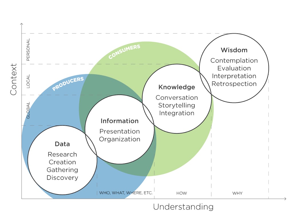
To be useful, data must go through a maturation process. It begins as random points that speak to individual things, such as comfort, happiness, satisfaction or profitability. Individually those single points of data are interesting, but its usefulness is limited and its message can be misinterpreted.
Only when you put data in context of other elements that are important to you, do you begin to elevate data to information. Information embodies context and helps you make decisions that you can compare and contrast and visualize. You can see information in new ways, offering insights that cannot be found by simply looking at raw data in isolation. By adding context and visual interpretation, you elevate data to the status of information, which is easier to understand and relate to more effectively.
The final maturation is this idea that information evolves into knowledge. Knowledge is information we’ve acted on. We’ve learned from the information. We understand how the information might impact our future and decisions to move forward.
We often miss the steps from data to information and knowledge. Yes, we know data is important, but data alone isn’t enough. You must move it through the different levels of maturity to make data valuable in a way that can inform and benefit decision making.
There are a couple of different ways to turn data into information. The first thing you can do is visualize it. That’s the simplest method. For people who aren’t numbers oriented, the graphic representation—graphs and charts—is very powerful. It makes data more accessible and easier to understand, providing a visual interpretation and offering context that helps inform a decision in a very simple way.
A more advanced strategy for offering context is through regression analysis, which can help determine where causation and correlation come into play. With regression analysis, you begin to ask interesting questions, such as: What is the relationship between glazing and EUI? What is the connection between email communication and project success? How does daylight increase occupant satisfaction? How does the size of team impact schedule compliance?
Moneyball for Design
Everyone talks data. But the industry is only starting to learn how to use data to effectively develop great design.
We’re really good about looking at data to tell us how we’re performing, but mutating from data to information and ultimately knowledge lets us dive into the deeper (and more valuable) question of, why are we performing that way?
It takes more than a general knowledge to analyze these elements. They must be evaluated in the context of the things that are important to decision making, and you must introduce people that understand data. That’s how our LPAred and Project Delivery Group teams add value. They understand regression analysis and the interrelationship between data points, which help advance the design process and deliver better buildings.
In many cases, you may find that less obvious data points may be driving good performance. In coming to that realization, the process highlights that intuition and tradition may not always be the best guide.
That was one of the lessons of “Moneyball,” Michael Lewis’ bestseller focusing on the use of data in baseball. Oakland A’s General Manager Billy Beane focused on data sets to evaluate player performance, using different numbers than the traditional metrics, such as home runs and strikeouts. Baseball researchers had discovered that walks and fielding percentage could have a larger impact on the game than the statistics managers traditionally used to make decisions.

It is highly parallel to the informed design process at LPA. Data can help validate if our intuition and professional design experience are leading us to the best solutions. But the analogy only goes so far. In architecture and design, you can’t entirely let data drive your decision making.
There is a balance between your intuition and your professional experience and what the data is telling you. Keeping a healthy balance helps you find the right solution that is best for the building user, your customers or your client. That’s an aspect people miss from the “Moneyball” story and one that’s beginning to come forth as the art and science of data analysis matures—it’s not simply about getting the metrics right.
For both architects and builders, our intuition and our professional experience are valuable, and we don’t want to let them go entirely. But now we need to supplement them with facts and figures. And sometimes the data is going to align with what we feel, and sometimes they’re going to show us that our intuition wasn’t really accurate. In many cases, what we think is the cause will be proven wrong—and it will make our intuition better.
Turning data into information and then into knowledge will allow us to let go of the things that are less important and focus on the elements we know to be true. The result will be better buildings for clients and end-users.
LPA Associate Principal Charlie Williams is responsible for the Project Delivery Group, which guides the firm’s technology, practice management, technical practice and quality efforts. He is also the 2019 Chair of the AIA Technology in Architectural Practice Knowledge Community, which serves as a resource on how technology advances innovation in the AEC industry.
This story originally appeared in Catalyst Issue 4 2019. Subscribe today to receive Catalyst, a quarterly publication that takes a deep dive into design ideas, industry leaders and initiatives.


