Traffik owner and CEO Anthony Trimino wanted to tell a different story with his firm’s new workplace in Irvine, California. The office needed to capture the global advertising and marketing firm’s energy and vibe, creating the type of buzz the company is famous for producing for clients. For Traffik, a corporate office building or traditional workplace was simply not going to work.
After a long search process — including research to learn more about the firm’s creative workflow and the staff’s varying needs — the company settled on a two-story space originally intended for a steakhouse in the center of a trendy outdoor retail and entertainment center, between an Apple Store and an H&M. The recent downturn in retail leases and the more restrictive nature of multi-tenant office environments made the choice a good fit, functionally and financially.
The retail setting provided a blank slate to develop Traffik’s workplace environment and an opportunity to put the firm’s culture on display. Traffik focuses on strategies to “establish deeply meaningful connections between brands and their audiences,” and the design had to reflect a deep understanding of the firm’s ethos.
“This solution is an experiment in interactive design that informs the way the user thinks, socializes, works and collaborates,” says LPA Design Director Rick D’Amato.
Creating Buzz
The new workplace for Traffik, a global marketing firm, developed into an experiment in interactive design, combining elements of hospitality, retail and workplace.

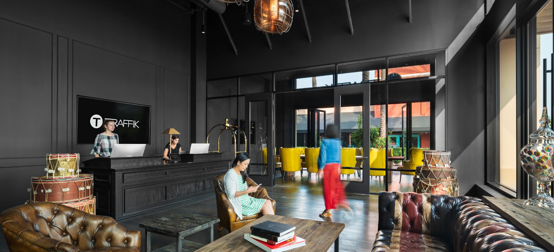
The design embraces its very public face and assumes an almost “hospitality” vibe, taking full advantage of the first level’s limited size and awkward configuration. The retail component is highlighted by a street view of the firm’s glass-enclosed podcast studio and main conference room. The openness and visibility grab shoppers’ interest and make the firm part of the mix in the entertainment center.
“For an advertising agency, having the opportunity to ‘put the goods in the window’ made perfect sense,” says LPA Managing Director Jeanie Kim.

The entry and reception area for the 22,000-square-foot office is meant to feel like a hip, urban hotel, with a check-in concierge, lounge waiting area and luggage carts. The design uses the unique 30-foot ceilings to provide elevated platforms for different workspaces, helping to transform the mall space into an environment specific to the agency and its work.
Traffik wanted to bring back the ambience of an old-school advertising agency, while reflecting the firm’s modern approach. An emphasis on simple metal frames, brick, wood floors and leather furniture define the space, which features a stadium stair, library, barbershop and collaborative “cocktail lounge.”
Traffik, like LPA, is a multidisciplinary, research-driven firm, which led to highly focused discussions about materials and lighting and how the spaces will affect users on many different levels. The design envelopes people as they move through the space. Closer to the center, the area is crafted to feel darker and more intimate. Art, bold graphics, color and the lighting design play important roles in the immersive experience.
Throughout the workplace, there is a constant connection to socialization and collaboration, reflecting a core element of the firm’s culture. The main stairs are used for many purposes, including small work sessions. Each conference room has a unique theme and purpose, offering various meeting modalities that inspire creativity and alternative thought.

Extra attention was paid to the importance of imagination and inspiration in the firm’s work. Traffik’s idea for the barbershop design, including vintage barber chairs, evolved from discussions about the social aspects of traditional barbershops and how those might spark different types of thinking and discussions in a collaborative space.
Wherever possible, the design sought to turn the challenges of the space into a benefit. With window space scarce on the second level, darkness was embraced and enhanced. The ambient darkness allows the color, features and themes of the different spaces to be more effective and dramatic.
The actual workspaces are minimal and designed as almost “libraries” between the event spaces. Long, collaborative tables provide constant interaction and collaboration, saving the specialty spaces for project teams discussions, pitch meetings and interviews.

As soon as it opened, the new workplace became part of the firm’s fabric. Images of the spaces were used on the firm’s website and in its promotional materials. In an article, the workplace was described as a “reflection of our culture — open, innovative, dynamic and absolutely one-of-a-kind,” which “positions us for our next phase of growth, triples our footprint and empowers unprecedented forward momentum.”
Trimino called the workplace “the physical manifestation of our mindset, of being present, of being noticed, of being recognized for the phenomenal things we’ve accomplished and the extraordinary work that’s yet to come.”


