Administrators at Cambridge Elementary School in San Antonio, Texas, explored the different ways building design can impact an arts education, as they considered revamping the school’s music and arts facility. They wanted teachers and students to see and hear the art and music, recognizing the importance of creating a stage to promote their work and help learners reach their creative potential.
The result: an entirely new space designed to provide a versatile and vibrant arts learning environment that properly displays and promotes student work. It also offers a masterclass in creating a harmonious landscape amid the larger campus layout.
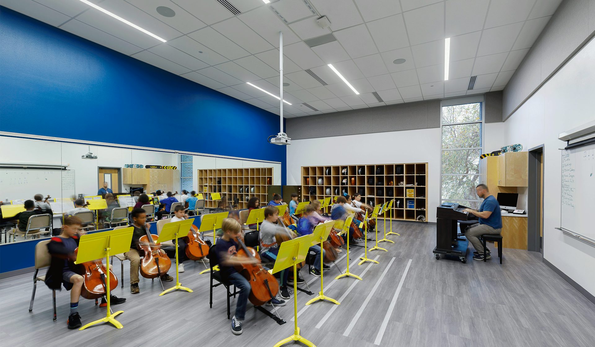
The design team tackled the project from the ground up. The original arts building, which opened in the ‘30s, had been rehabbed and renovated a dozen times over the years, becoming a functional, Frankenstein-esque space lacking the necessary amenities for a modern curriculum. There weren’t enough practice rooms or acoustically treated spaces, and there was no climate-controlled storage for large instruments such as cellos (a key consideration during Texas summers).
An Arts Center in Harmony
At Cambridge Elementary, a new music-and-art center puts the work of the learners on display and changes the relationship between arts to the campus.

The old building simply wasn’t the right home for creative classrooms, especially for a district that prides itself on developing the arts, says Sara Flowers, LPA San Antonio Studio Director, who managed this project. The Alamo Heights Independent School District decided to tear it down and start from scratch.
“If you want to play in the orchestra in middle school in this district, you need to get a good start in fourth or fifth grade at Cambridge,” she says. “That old, cramped building wasn’t the best environment for that kind of learning.”

LPA has a long working relationship with the district, which helped focus design discussions. In 2015, designers had worked with the district on a master planning initiative, which defined many of the district’s long-term goals. For the music and arts facility, designers and architects went deeper, exploring more experience-driven ways to describe, design and realize what users wanted. The process started with staff meetings focused on the style of learning they wanted to foster. Teachers agreed on two central tenets: They wanted the education to be “rigorous” and “creative.” The designers also conducted a weeklong series of interviews with students to understand their needs and explore ways to improve awareness of the activities.
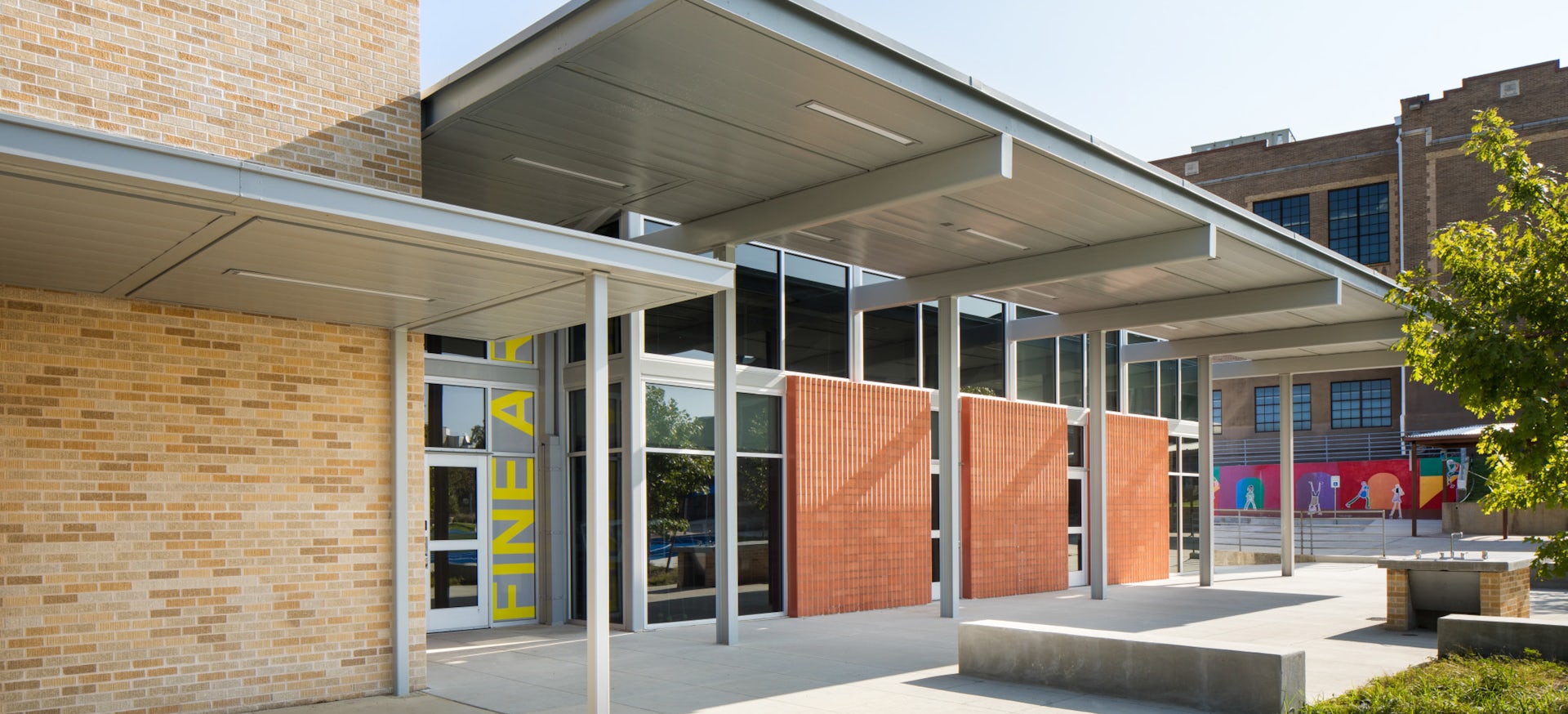
The new arts center offers students more space to explore their creativity and more public opportunities to showcase their work. Boasting a streamlined, glass-and-metal exterior, the new, 9,500-square-foot facility is divided into six rooms: two for string instruments, two for general music and two for art, with a shared kiln space. The dark, cramped, windowless building of the past has been reimagined with more openness, including north-facing rooms to take advantage of natural light throughout the school day. The music rooms connect, creating space for larger classes and ensembles to practice and perform. The layout also offers clean, crisp sound, with windows placed high to avoid distractions.

For the music and arts facility, designers and architects went deeper, exploring more experience-driven ways to describe, design, and realize what users wanted.
The art rooms include overhead outlets and power wheels for tools like glue guns, as well as posable task lighting to help eliminate shadows when students are sketching. A maker’s porch allows students to work outside amid planter beds. And outside every classroom, dedicated display space creates a gallery of student work.
“We wanted them to experience moments of pride seeing their work on display and to be more aware of what their classmates were working on,” says LPA Design Director Kate Mraw.
The facility repositioned arts within the campus. Now students walking past the arts building on their way to the new gymnasium can see their friends on the maker’s porch or look through the windows to see work on display.

The LPA team took advantage of the demolition and rebuilding process to rework the surrounding landscape, according to Project Designer Jim Oppelt. “A big part of the project was rethinking the play areas and fields around the music building,” he says. A playground located across the street was moved to the main campus, linked to the center by a linear park lined with blue-and-orange play structures, benches and statues. The redesign added space for play while making pick-up and drop-off easier and more efficient.
The design added efficiency and cost savings in many areas. Low-flow fountains and toilets, better insulated walls and new windows with wrap-around shade structures helped reduce heat gain in the summer and insulated the building in the winter, cutting heating and cooling costs and overall energy usage.
When the building was finished in spring of 2019, faculty moved in during spring break, excited to give students a chance to use the new space for the rest of the school year. Teachers and students explored the new spaces, including the new stages, which might lead to larger stages in the future.


