There is nothing new about the idea of combining different grade levels on one campus. “In a way, it’s a throwback to the little red schoolhouse, where all the students gathered for their lessons,” says LPA Design Director Helen Pierce.
The design for the Agnews Campus, developed by the Santa Clara Unified School District, takes the concept into the next generation, with a public school campus that seamlessly integrates the different schools, while keeping each distinct and secure. Designed to handle more than 3,000 students, pre-K through 12 grade, in fast-growing Santa Clara, the campus focuses on flexible indoor and outdoor learning spaces, reflecting a consistent emphasis on student-centered learning and collaborative spaces.
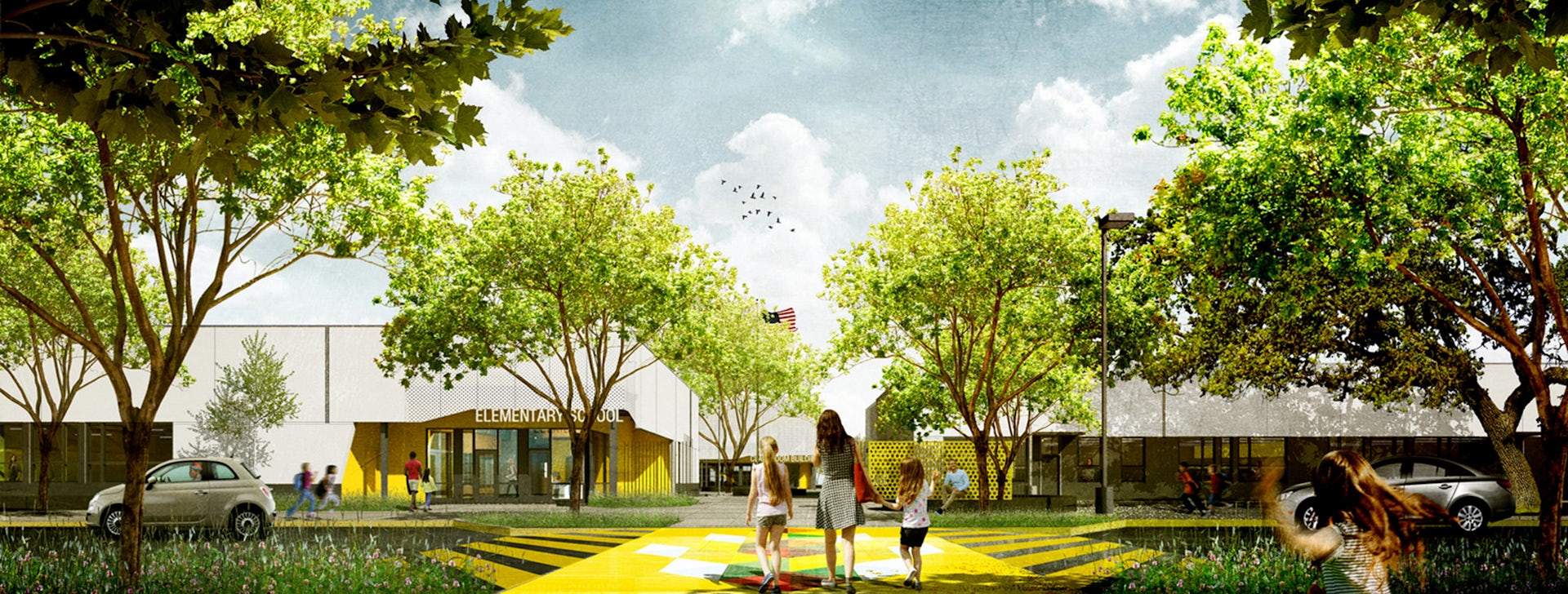
Instead of walling off the separate schools, the design creates a sense of connection and progression between the schools. The progression can be seen in the size of the buildings, which start at one- and two-stories on for the elementary school campus, moving to two stories for the middle school and three stories for the high school. The collaborative areas and outdoor learning spaces also advance and become more elaborate from school-to-school, creating more student-centric and independent learning spaces to support the different levels of learning.
Three Schools in One
The design for a new K-12 campus in Silicon Valley rethinks the concept of a combined elementary, middle and high school campus. New efficiencies and a focus on 21st century learning environments give new life to an old idea.

“It gives them a sense of moving along a path,” Pierce says.
The district hadn’t built a new school for decades, creating a sense of opportunity and apprehension around the new project. “We want the facilities to last at least 50 years and be a prototype for the rest of California,” Santa Clara Unified School District (SCUSD) Board of Education President Andrew Ratermann said at the groundbreaking.
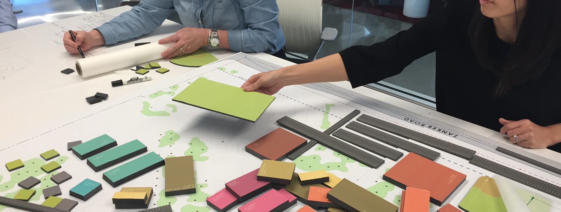
The design evolved through a seven-week programming session, which included an extensive outreach process with district leadership, teachers, parents and students. Educators were asked to step back and consider the bigger picture. What do you want your students to know, do and be? How can your graduate profile inform design decisions? What does sustainability mean to you?
“We went deep to find the real vision of the educators and the students,” says LPA Design Director Kate Mraw.
Based on the feedback, the designers developed the campus around guiding principles coined S.M.A.R.T. — sustainability, mindfulness, adaptability, relevancy and transformational. Inspired by an ethos of stewardship, the schools were located near each other to easily allow a shared use of facilities and enable upper-level students to mentor younger students. The middle and high school share a media center; while they have separate spaces, they can come together in a shared innovation space. The high school athletic facilities were placed adjacent to the site of a future city park, creating opportunities for the community and campus to grow together.
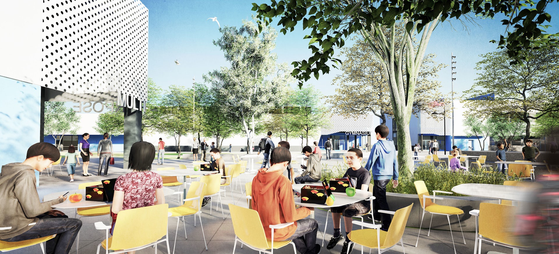
By clustering each school in two- and three-story buildings, the layout preserved open space and protect some large existing oak and sycamore trees. Each school is wraps around its own large exterior quad and will have its own distinct identity, creating a sense of cohesiveness and achievement as students progress through the levels. Outdoor spaces were treated as extended learning environments, recognizing that learning spaces and play spaces can play important roles for teachers and students. “We wanted to create a powerful connection between the outdoor and indoor spaces,” Pierce says.

A S.M.A.R.T. DESIGN
The new Agnews Campus focuses on sustainability, mindfulness, adaptability, relevancy and transformation—S.M.A.R.T.—the guiding principles developed with the Santa Clara Unified School District. The design preserves open space and connects the different schools with an emphasis on outdoor learning environments and a clear progression between each level. From elementary school to high school, the spaces become more involved and interactive, reflecting each school’s pedagogy and a focus on student-centric learning.
1. SHARED SPACES The design makes the most of shared-use opportunities by placing the high school athletic facilities adjacent to the site of a future park.
2. GRASSLANDS On the elementary school campus, the quad, situated among the low-lying grasslands, connects students with nature and provides an outdoor learning environment to help them learn more about their surroundings.
3. WOODLANDS The quad for the middle school recognizes the students’ transitional phase with social areas, a flexible play lawn, an amphitheater and outdoor makerspaces.
4. FOREST The high school quad takes full advantage of existing trees and creates a variety of spaces for social and learning spaces, as well as pep rallies and other school-wide events.
5. RIPARIAN ZONE A central green zone connects all the campuses and provides space for a student garden, as well as incorporating the stormwater management system and historic artifacts of the site.
6. SUSTAINABILITY Proper siting, orientation and massing maximize daylight and views, while minimizing energy loads. Integrated design saves water and supports a “build lite and build less” strategy.
This story originally appeared in Catalyst Issue 3 2019. Subscribe today to receive Catalyst, a quarterly publication that takes a deep dive into design ideas, industry leaders and initiatives.


