When consumer products giant MerchSource bought an aging 1980s complex in Irvine for its new headquarters in 2017, the company’s leaders wanted to create a new type of office environment. The company, which designs, showcases and distributes a long list of consumer brands—including FAO Schwarz and Sharper Image—envisioned spaces that seamlessly combined focused office environments, design studios, retailer showrooms, display areas and social spaces.
The space was designed as a showcase for the individual brands represented by MerchSource. A series of branded retail showroom spaces offer opportunities for the firm’s clients to immerse themselves in the specific brand; they also produces spaces for meetings and collaboration. A carefully cultivated overriding aesthetic expression was developed as a bridge between the common areas and the brand-related spaces, creating a cohesive space for staff and clients.
The Social Workplace
A new office for MerchSource blurs the lines between social spaces and workplaces, reflecting the company’s unique brand and culture.

“The design for this facility provided the opportunity to better understand the relationship of the MerchSource brand, in contrast to the retail brands which they represented,” says LPA Director of Workplace Interiors Rick D’Amato. “This in turn gave them a better understanding of who they are as a company.”
MerchSource’s unique form of business led to a unique design. Work is encouraged to happen anywhere and anytime. Spaces were designed to provide varied environments for meetings and collaboration, while inspiring creativity.
LPA’s integrated team of architects, interior designers, landscape architects and engineers took a holistic approach to renovating the facility, which included a 100,000-square-foot, mid-rise office building and a 30,000-square-foot, single-story former auto garage with underground parking. The project also revived the antiquated existing exterior open space that bridged the two buildings, resulting in programable spaces as an extension of the interior environments. Flexibility was essential, given the recognition that many spaces both internal and external would serve multiple roles.

The courtyard, which was once dominated by a large concrete fountain, was cleared and transformed with drought-tolerant California native plants and trees. Two well-defined areas were created with a complex mosaic of related uses to accommodate staff and client meetings. The design includes private areas for MerchSource, while also providing common amenities for the building tenants. The spaces are defined by an outdoor kitchen and sports bar, a secluded dining area, a fireplace, hanging benches and an amphitheater.
“The courtyard is a vibrant magnet for the company, alive with people day and night,” says LPA Landscape Architect Danielle Cleveland. “All visitors walk past the outdoor areas on their way to the entrance, so they are immediately aware this is an active workplace.”
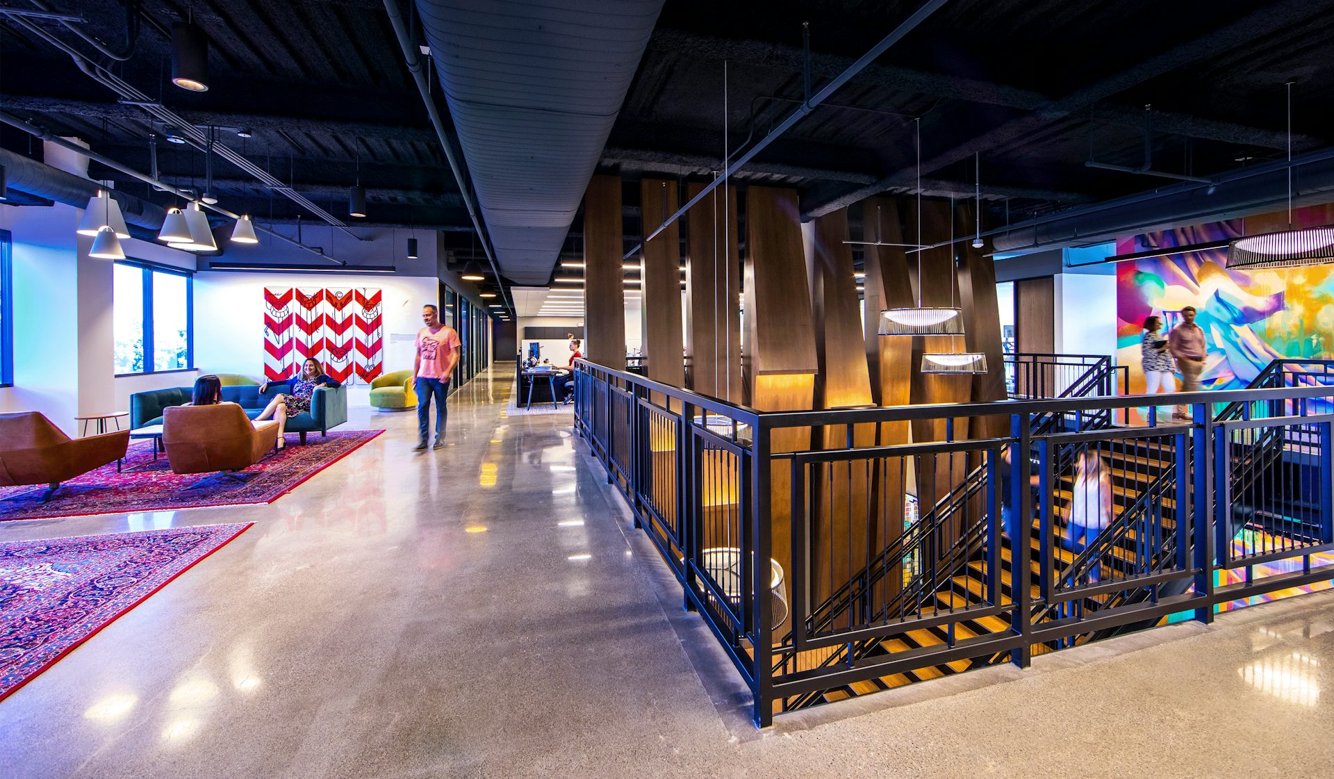
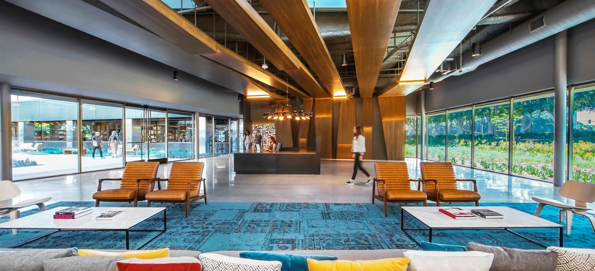
The new entrance to the headquarters building is a massive open-air lobby. Inside, the flowing spaces enhance the staff experience, creating a blend of areas to accommodate employees on flexible work schedules, as well as collaboration zones. The office serves both customers and staff, while enhancing indoor-outdoor links to the exterior amenities.

“Most of our current workplace designs include large spaces that can be used during the day for collaborative work and at other times for entertaining,” D’Amato says. “MerchSource pushed this idea further. It’s almost like we designed work areas that support the social spaces.”
The design reflects MerchSource’s focus on staff well-being with a full-service fitness center, bike storage, outdoor social and dining areas, respite spaces, an abundance of comfortable lounge areas and a common-area café connected directly to the exterior amenity spaces through a large, glass bi-fold wall.
To brighten the space and upgrade the office’s operating efficiency, the dark film was removed from the glass to admit more natural light. At the same time, filters and architectural diffusers were added to large skylights to reduce glare and heat gain. Ceilings were removed to add height and volume. Lighting was designed for dramatic effect and the illumination of product, art and displays. Economical, efficient mechanical systems and other energy-conserving devices replaced outdated, wasteful equipment.

Throughout the office, LPA designed the spaces, inside and out, to feed creative energy; original art throughout adds to the atmosphere of imagination. Noted Los Angeles street artists Retna, El Mac, Hueman and Vizie created original installations which work as a connective narrative throughout the public and private spaces. Seen as a conduit for creative inspiration, the art is intended to engage visitors through three-dimensional applications. “With this complex, intricate design, we helped MerchSource express and reinforce their own brand, so others can clearly understand and experience it,” D’Amato says. “It’s a space that unfolds itself to the user and evokes curiosity and wonder.”


