A distinguished historic bank building is coming back to life in downtown Sacramento with interior renovations that contrast modern elements with the original 1915 structure. Several of the upper floors, always leased as offices above the banking floor, have been redesigned and upgraded as flexible, open co-work spaces.
The corner building with two-story arched windows at street level is a City of Sacramento historic landmark; its exterior may not be altered without city permission. But the owner wanted the interiors to attract modern companies, particularly technology start-ups.
“We were asked not to replicate the original conditions,” says Anthony Harris, Managing Director and Associate, of LPA’s Sacramento office, referring to a practice that preserves the authenticity of historic buildings. “The goal was to update the interiors for today’s clientele.”
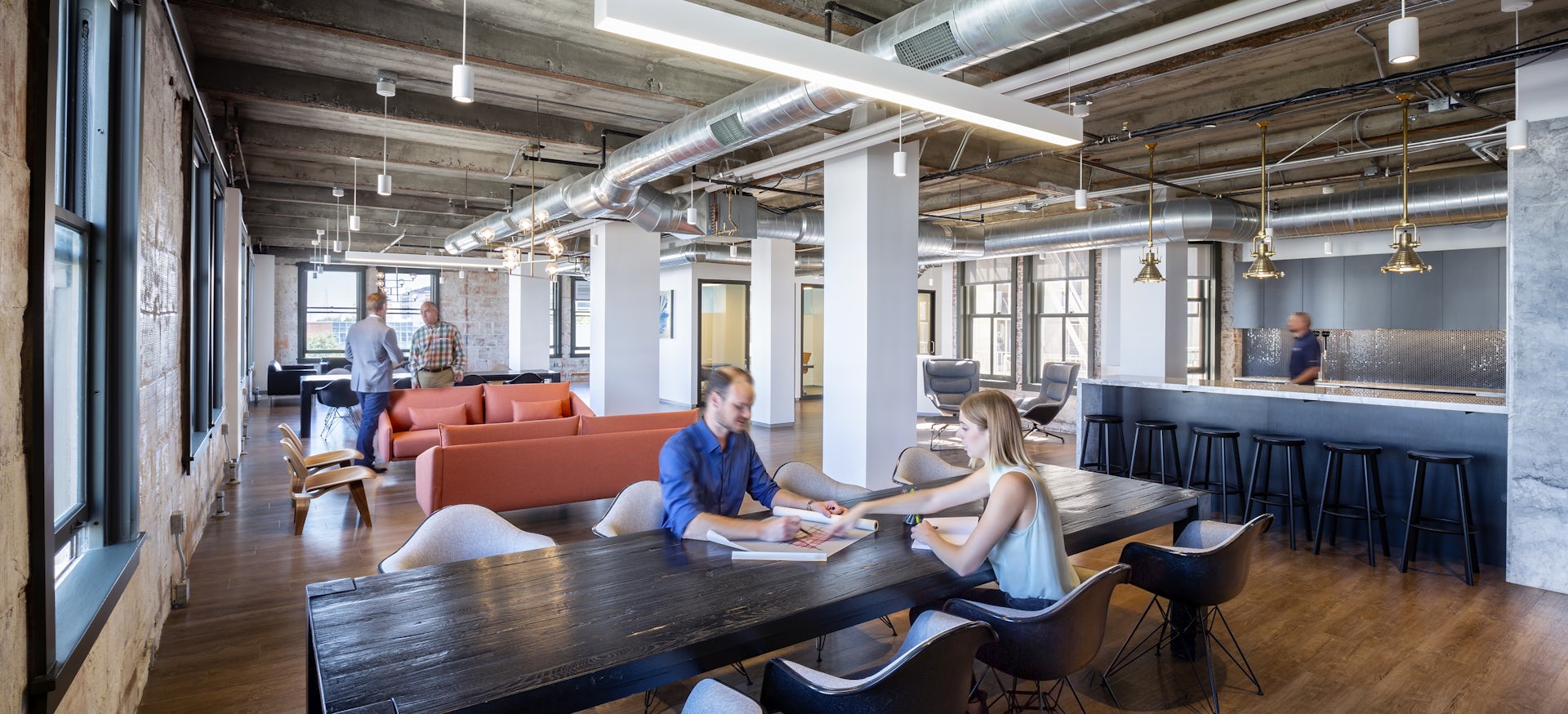
What had been a warren of individual offices on the 4,821-square-foot fifth floor has been transformed into flowing work and meeting spaces. One or two people may settle into comfortable lounge areas under modern chandeliers; groups may gather around a table or on barstools at the kitchen’s sleek marble bar. Its hefty marble slabs — one-inch thick and 4- by 8-feet — are recycled from the walls, evidence of the Capital National Bank’s original richness.
Molding the Past for the Present
In Sacramento, a historic building is modernized and refurbished for new clientele.


Removing the old office walls revealed rows of original, identical wood-framed windows. Now, natural light floods in, reaching into glass-walled, private rooms and illuminating corridors. The subtle rectilinear order of defined spaces and white, structural piers help guide people through the open floor plan while echoing the simple geometry of the four-paned windows. They offer previously obstructed views of downtown.
LPA also removed plaster to expose the 1915 clay-tile perimeter walls and pulled down ceilings to show concrete beams with rusty bands of steel and to maximize overhead space. Against this textured backdrop, new ductwork and utilities are woven in for an urban loft effect. Classic mid-century modern furniture, minimalist overhead lighting and a beer tap at the bar contrast with the historic ambience.
“Inside are unique elements, like cast-iron stairways with marble treads, that both the owner and the city wanted to keep,” says Harris, who discussed the changes with the city preservation architect. The brass-trimmed mail chute adds what he calls “vintage character.”
To help develop the entire building’s potential with the owner, LPA Practice Director Julian Watt is proposing to turn the double-height main banking floor into a restaurant with a round bar. The room’s stone tile floor with brass inlay and other bank fixtures inspired brass accents to the proposed bar. Raised lounge seating along towering windows would allow guests to see and be seen at this busy corner site. The basement could become a wine bar with its collection displayed in one of the many old bank vaults, and the rooftop of the adjacent annex could be developed as an open-air amenity space overlooking the city’s new sports arena and a lively city park.
The design would meet the owner’s desire for a mix of 1915 and 21st-century building components and amenities, revitalizing the building, top to bottom. “The combination of original elements and new features and finishes adds richness in a modern manner,” Watt says.
This story originally appeared in Catalyst Issue 1 2019. Subscribe today to receive Catalyst, a quarterly publication that takes a deep dive into design ideas, industry leaders and initiatives.


